Interior Design Trends 2026: What Developers Need to Know About Fixtures, Finishes and Showhome Details
- May 20
- 8 min read
Updated: May 20
Every year, the internet gets flooded with trend content aimed at homeowners. But if you're a developer, housebuilder or investor, you don't need to know what looks good on Pinterest or Instagram. Not really. You need to know what moves buyers, supports your GDV, positions your development ahead of the competition on launch day and gives you a fantastic marketing tool.
This year's trends, both macro and micro, are telling a consistent story: warmth, tactility and personality are winning over the cool, generic finishes that defined the last decade. And for developers, that's commercially very useful information. Read more about it here.
But what on earth is a macro or a micro trend, you might be thinking?! In a nutshell, Macro trends have a much longer term focus as they’re more of a cultural shift, for example the trend towards wellness as a central focus of our way of living. Micro on the other hand looks much more into the detail of design such as a specific styling detail or paint colour. Focussing too heavily on micro trends for the sake of it will date your property, on that I have no doubt.
In this blog, I’m picking out a handful of key items to focus on. The fixtures, finishes and decorative details that are most relevant to developments and/or new-build showhomes in 2026.
The good news for developers is that many of this year's most compelling micro trends are deliverable at a finish and staging level, not at a structural level. You don't need to re-specify your development to crack it!
The Macro Trends Picture
Before we get into the detail, it helps to understand what's happening at the broader level because the macro context determines which micro details land well and which feel jarring.
Warm Neutrals and Deeper Colour
The era of flat white walls and cool grey everything is decisively over. And more and more developers understand this. I know because I talk to many around the country. This is good news. Across forecasts and trade shows for 2026, the direction is clear: stone, biscuit, clay, taupe and creamy off-whites with warm undertones are the new grey! Charcoal and flat white are reading as harsher and less desirable.
Crucially, this is also the year where richer accent colours (my personal favourites) such as terracotta, olive, chocolate brown, plum and midnight blue, are being used to create depth and points of interest rather than all-over heavy schemes.
Think a dressing room fully drenched in deep olive, or a media wall in rich plum, to complement the kitchen, set against warm neutrals throughout the rest of the plot. What I definitely do not mean is painting three white walls and sticking some colour on the 4th for the sake of it!
Why it matters commercially: Warm, grounded colour palettes photograph better, feel more premium, and communicate "liveable" to a wider range of buyers. As a result they support “perceived value” in a way that cold palettes do not.
This moves us nicely on to the next point.

Darker, Richer Woods and Texture
Cool, ashy Scandi timbers are losing popularity with designers and warmer woods such as walnut are back and I’ll bet they’re here to stay for a good chunk of time.
Alongside this, there's a strong push toward layered, tactile materials: bouclé evolving into slubby wovens, hand-woven textiles, irregular tiles, and finishes that feel genuinely crafted rather than produced. I'd argue it's partly an AI antidote. The more digital our lives become, the more we reach for things that feel genuinely made.
Why it matters commercially: Darker timber reads as higher specification without necessarily costing more - it’s that whole perceived value thing again. You can make smart changes to create a more premium feel, with little or no cost, which is exactly the kind of specification developers need, right?

Nature, Wellness and Longevity
Biophilic design is evolving into something more commercially useful: wellness design. Natural light, nature-inspired palettes, indoor planting and calm spatial layouts relate to themes of mental health and rest that resonate deeply with today’s buyers and, especially so, with buyers of the future.
There's also growing focus on longevity: quality over disposable, repairable over replaceable, and homes that genuinely support everyday life: function over fashion for the sake of being fashionable.
Why it matters commercially: Buyers aren’t just purchasing square footage. In fact, they don’t see it like that at all - they’re buying a lifestyle. Your showhome is your only opportunity to show them how. And showing is better than telling.
The Micro Detail Trends
This is where we get specific.
These are the small-scale, visual details you'll see everywhere on inspo boards and at trade shows in 2026. The things designers can get giddy with excitement at, and the ones most relevant to fixtures, finishes and interiors styling.
They’re also the ones that have the potential to date-stamp your property or development, and so, as I’ve already mentioned, designers need to proceed with caution and ensure that they make sense within the bigger picture of the design.
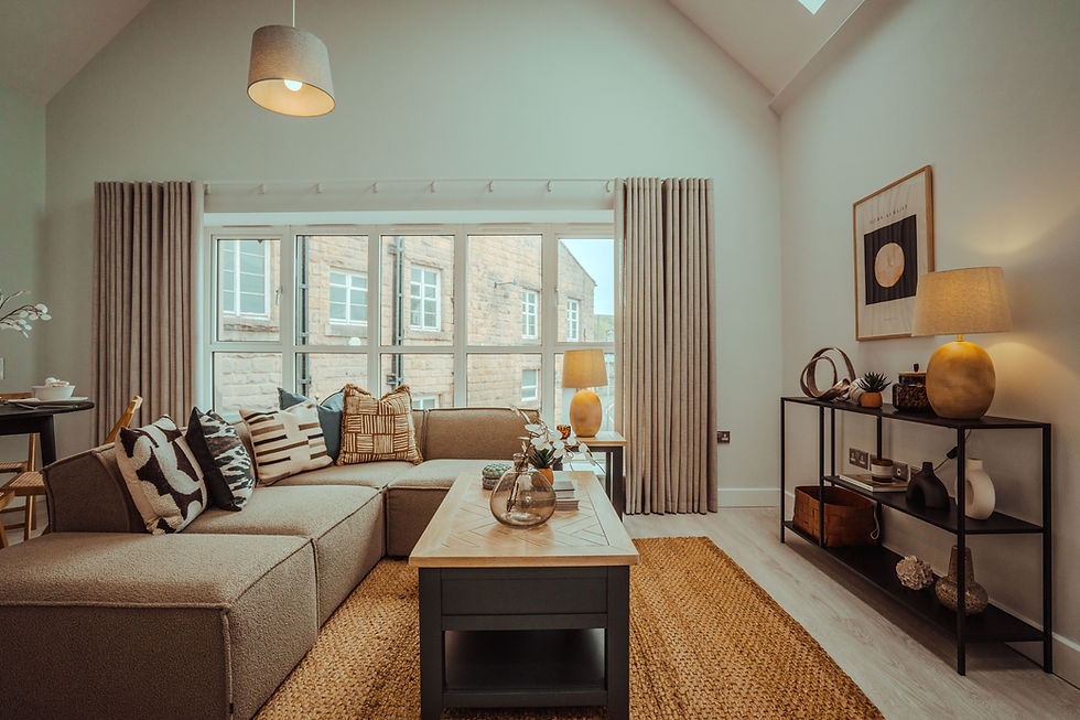
1. Patterned Sofas and Hero Upholstery
Pattern is moving off the cushion and onto the seat. Checks, plaids, small-scale florals and textured weaves on sofas, accent chairs and armchairs are very 2026!
Why? It’s all about the hero piece of furniture becoming the (interiors speak…) ‘visual anchor’ of the room rather than a neutral backdrop for accessories. If you’re keen to try it but worried about getting bored, go for a stripe. It will never date. And in the right setting (a holiday let or a showhome, for example) and designed well as part of a wider scheme, this look could work to set you apart from everyone and everything.
That said, it might not be appropriate in all settings and there will be a higher cost implication to it. If done right, though, it gets a big tick from me.
2. Decorative Details: Mounts, Trims and Lampshades
This is arguably the easiest and most commercially efficient micro trend to deploy in a showhome or staging context.
Decorative picture mounts (contrasting coloured or patterned mounts inside frames) are specifically called out as a 2026 detail across multiple trend forecasts, and I have some artwork framed like this in my own home. Patterned, gathered or pleated lampshades, scalloped edges and fringing on lamps, cushions and soft furnishings are everywhere in this year's decor coverage. Granny chic is here and doesn’t show any signs yet of hobbling off!
Why does this matter for developers? Because it costs almost nothing, photographs beautifully, and immediately moves a room away from the generic new-build aesthetic without touching the fixtures or finishes specification. A couple of statement lampshades, a thoughtfully mounted piece of artwork, a cushion with a contrast trim - you can see how these small details, in the right context, add character and personality and a bespoke, high end feel.

3. Colour Drenching and Colour Capping
Colour drenching is the term used to describe taking the same colour across walls, woodwork, trim, skirting and ceiling and to be fair, it’s not new in design. It’s been around for the best part of 20 years.
Colour capping, however, wrapping the upper portion of a wall and ceiling in a stronger tone, is very much in the 2026 spotlight and is recommended for smaller spaces. For developers building new builds, this is a great way to add character.
Cloakrooms, utility rooms, and bijou snug spaces are often the hardest rooms in a development to style interestingly. Colour capping helps to create a warm (that word again), distinct, cocooning space that makes buyers feel calm and relaxed.
From a colour psychology perspective, this technique is not just visually compelling, and it feeds into all our design work at WildKind Interiors. The colour you choose for a drenched space communicates a specific psychological message to the viewer.
A deep teal cloakroom suggests sophistication and is likely to make people feel balanced and anchored (teal is a blue-green and so has some psychological characteristics of both). A warm terracotta kitchen feels nourishing and sociable. These are not aesthetic choices; they are strategic ones.
4. Gloss, Metal and the Return of Shine
Several 2026 trend reports are specifically calling out a return to gloss and it’s been a fair while since that was the case. Lacquered furniture, high-gloss cabinetry, and gloss paint can be used selectively for drama. In kitchens and utility spaces, stainless steel worktops and professional-style detailing are also cited as a bolder micro trend making a comeback.
The key word here is selectively. A high-gloss lacquer sideboard in a dining area, glossy bedside tables in the master bedroom, or a gloss-painted internal door used as a feature moment all signal the trend without locking a whole space into a finish that may feel dated in two years.
This trend also aligns neatly with the return of warm metallic accessories; brass, antique bronze and unlacquered metals, which add warmth and patina rather than the cold chrome of the previous decade.
Common Mistakes Developers Make with Trends
Don't apply trends all-over. The power of a colour-drenched room is that it's a contained moment. Drenching every room dilutes the effect entirely.
Don't use gloss throughout. Selective gloss signals sophistication. All-over gloss signals a trend moment, and buyers can tell the difference.
Don't skip the decorative details. The lampshades, the mounts, the contrast trim; these are the details that make a room feel finished. Without them, even a well-specified showhome can feel like a floor sample.
Don't brief your designer after the FF&E is locked. Trend intelligence has the most commercial leverage at the specification stage. Showhome styling decisions made after the build is complete are always working with more constraints than they should be.
FAQs
Do I need to follow trends in a new-build showhome?
Not blindly, but trend-awareness matters. A showhome that feels dated relative to what buyers are seeing in the market creates friction at exactly the wrong moment. The 2026 direction - warm, tactile, personal - happens to be commercially very well-aligned with what drives emotional connection in buyers, so following it is low-risk and high-reward.
Should I use colour drenching in my development?
Used well, yes. The key is targeting contained spaces such as cloakrooms, snugs and utility rooms, rather than open-plan living areas. A fully drenched cloakroom creates a genuinely memorable moment that buyers cite in feedback, and sales teams can anchor conversations around.
Should I use gloss finishes throughout a showhome kitchen?
No. In 2026, gloss works best as a selective accent - on a piece of furniture, a feature door, a sideboard, rather than an all-over kitchen finish. A full gloss kitchen risks feeling like a trend moment rather than a considered choice, which can work against broader buyer appeal.
What to Do Next
If you remember one thing from this blog, let it be this: the details in your showhome are not decoration. They are commercial decisions. The 2026 micro trends give you a very clear, very low-cost toolkit for making those details work harder. The question is whether you brief your designer early enough to use them strategically.
If you're planning a scheme or showhome in the next 6–12 months, get in touch, I'd love to talk through how WildKind can help you make design decisions that support your numbers from day one.