The 7 Elements of Interior Design: Let’s Talk About Pattern
- Jul 9, 2025
- 6 min read
Written by Louise Wynne, Founder of WildKind Interiors
Here we are. The final blog in the 7 Elements of Interior Design series. We’ve covered space, line, form, light, colour, and texture, and now, it’s time for the one that tends to make people the most nervous: pattern.
I get it!
Pattern can feel a bit “out there.” Especially when you’re trying to appeal to buyers or guests who might not share your taste. But used properly, pattern isn’t just decorative fluffy stuff. It adds character, personality and flair. And helps your property stand out in a crowded market. Why? Because most people have no clue how to approach it or use it successfully.
They dip their toe in the proverbial pattern pond, and then quickly pull it back out again, before retreating back to plain ‘griege’ (grey and beige) everything. Oh yeah, and maybe with a dark blue feature wall thrown in for good measure.
I’ve been working with design, colour and pattern for almost 20 years. It doesn’t scare me. I live and breathe it (being dramatic?... possibly!) so let me help show you the way.
What Is Pattern in Interior Design?
Put simply, pattern is a repeated decorative design. It could be geometric, floral, abstract, tribal, organic, or even text-based. Pattern shows up in wallpaper, tiles, fabrics, rugs, in the layout of joinery or brickwork; basically anywhere there’s repetition.
It can be subtle.
It can be full ON.
And everything in between.
Please note. A painted feature wall doesn’t count.
Sorry not sorry!
Pattern When Selling: Less Is More (But Still Use It)
When you’re staging a property for sale, you need broad appeal. That doesn’t mean stripping every ounce of personality out of a space, but it does mean using pattern with care.
Here’s where pattern works best in homes for sale:
Patterned tiles in bathrooms or kitchen splashbacks
A soft patterned rug in a living space, or under a bed or dining table
A mix of patterned cushions on a plain sofa
The goal here is to add interest without putting people off. When selling, pattern should be used with a light touch. Enough to stop the space feeling bland, but not so much that it distracts from the overall feel of the room.
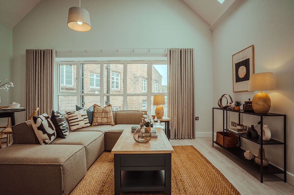
When I’m staging properties for sale, or designing a show home for a developer, I love to use pattern as it immediately elevates an interior space. Pattern feels luxurious. It gives an expensive finish. It sets an interior apart from the competition. (I think I’ve already said that, but it can’t be said enough.)


The last two photos are from an apartment for sale in Leeds that once staged sold within a few weeks after being on the market for several months.
Pattern in Serviced Accommodation: Go Bold or Go Home
Now this is where things get fun.
Short term lets like holiday homes and serviced accommodation are the perfect place to be braver with pattern (and colour, if you want to know more about that, read my earlier blog: 7 Elements of Interior Design: Colour – Part 1).
Why? Because short-term let guests aren’t making decisions like long-term buyers.
They’re looking for something that feels exciting, different, or a bit special. A well-designed space with thoughtful use of pattern can instantly create that emotional connection and help your listing stand out.
Here’s how to use pattern confidently in SA:
Clash different patterns in the same colour palette. Think a floral cushion against a striped throw on a bold headboard
Use wallpaper with personality: blousy florals, botanicals, retro geometrics, mural-style prints. It all works when the colour scheme holds it together
Layer scale: mix large-scale patterns with smaller, tighter prints
Mix pattern style: You can mix florals with stripes, checks with geometrics, and even all four… as long as the colour palette holds it together. Keep the tones consistent and the patterns will play nicely
But Wait… It’s Not Quite That Simple
Although I’ve just made it sound like there are no rules when it comes to pattern matching, I’m afraid to say that’s not strictly true.
It’s more complicated than that.
Keeping to a consistent colour palette is a great start, but the patterns also need to sit well together stylistically. For example, pairing a traditional floral with a bold, graphic geometric might jar, unless you’ve intentionally layered them with balance, scale, and a common thread in tone or mood.
To make pattern mixing work, you need more than colour harmony. You also need:
A shared design language e.g. soft and organic, or structured and graphic. Don’t force completely opposing styles together
Varied scale – as I’ve already mentioned. Combine one large-scale pattern with a smaller, tighter one to avoid visual overload
Solids to ground the scheme; give the patterns space to breathe with plain elements in between
Done well, pattern brings warmth, life, and memorability. It makes your listing pop in a sea of bland Airbnbs and Booking.com pages that still think a feature wall is daring.
When scale, style and colourways meet. 2 SA properties with bags of personality…


The Psychology of Pattern (Yes, It’s a Thing)
Pattern isn’t just visual noise. It affects us emotionally and psychologically, just as colour does.
Large-scale, flowing organic patterns tend to feel calming and spacious. Think soft botanical prints or painterly strokes. Smaller, repetitive geometric patterns can create a sense of energy and structure - ideal for energising a communal living space in an HMO, for example.
Too many busy patterns in a small space can overwhelm the senses. But too little, especially in a serviced accommodation setting, can leave it feeling flat and forgettable.
The human brain loves a bit of repetition and contrast. It’s how we make sense of space. A few well-placed patterns can anchor a room and make it feel more dynamic and well-designed.
Louise’s Top Tips for Using Pattern Like a Pro
Keep the colour palette tight
You can go wild with pattern styles; florals, geometrics, stripes, checks - as long as the colours speak to each other.
Mix scales
A giant leaf print + a smaller geometric motif + a simple stripe = expertly layered, not chaotic. The variety keeps things interesting without overpowering the room.
Balance with solids
If you’re going bold in one area, say, curtains or wallpaper, give the eye a break elsewhere. A solid-colour sofa or plain bedding helps anchor the space and makes the patterns feel intentional, not overwhelming.
That said, please don’t opt for this just because you’re scared to commit to all-over pattern. It has to be because the overall feeling of the room, and the design style, lends itself more to this approach than going all out does.
I can spot the difference a mile off between those who have intentionally created a calm and balanced room, with a hint of pattern, to those who are too scared to commit to pattern!
Embrace patterned wallpaper
Especially in hallways, cloakrooms, or bedrooms in short term lets. Papering all walls will totally transform a space, wow your guests, and is a relatively inexpensive way to add drama.
Remember your market
Selling? Be subtle.
SA? Make it memorable.
Want to learn more?
Final Thoughts: Pattern Is Personality
Pattern is often the missing ingredient when a room feels flat, cold, or forgettable. It adds life. And when used confidently, with a clear colour palette and varied scale, it adds value too. How? Remember more eyes on = less voids and a higher value.
So don’t be afraid of it. Embrace it. Learn how to use it well, and you’ll have another brilliant tool in your interior design toolkit. One that sets your properties apart and makes people feel excited about staying there (or buying it!).
About the author: Louise Wynne has been designing, styling and installing showhomes since 2006. Combining interior design and styling with her colour psychology expertise, Louise gets to the heart of her clients' requirements.